I started my career as a packaging designer in Los Angeles at Southern California Carton Company designing primarily for the cosmetic and food industries. Products were diverse and ranged from skin-care systems to frozen pies. When I was senior art director at Danaher, I worked on packaging products for high-end medical equipment. I currently teach packaging design classes at Otis College of Art and Design in Los Angeles and am a freelance graphic designer specializing in packaging, branding and logo creation.
Packaging design
Preliminary sketches
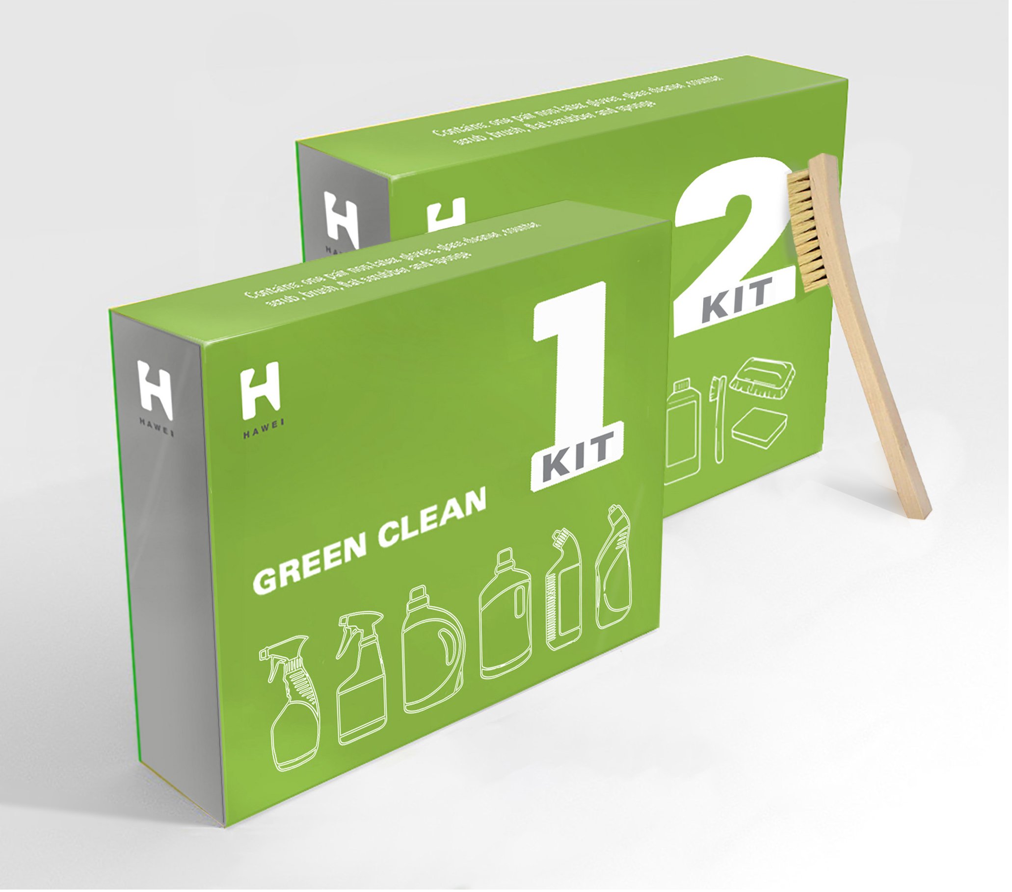
Company: Hawei Inc.
Packaging design | Logo creation
Packaging design | Logo creation
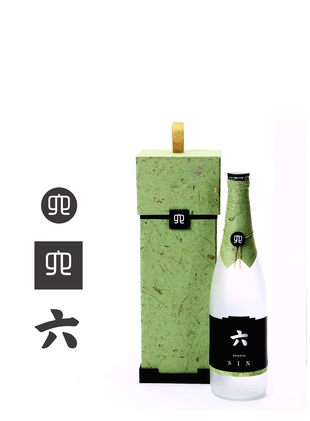
Company: Kurosawa Brewing Co.
Logo Creation | Packaging design | Marketing narrative
Branding | Packaging design | Logo creation
Company: SybronEndo
Branding | Packaging design | Logo creation
Packaging design
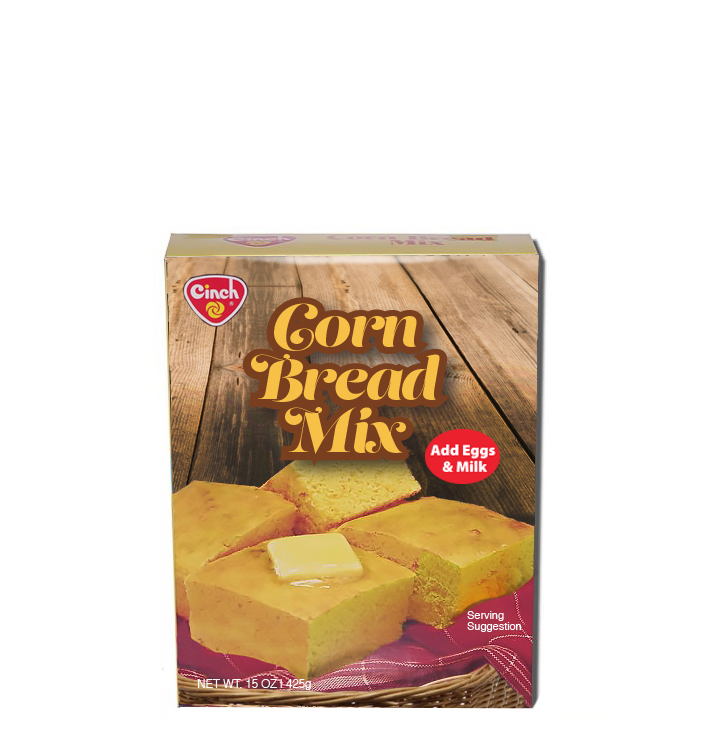
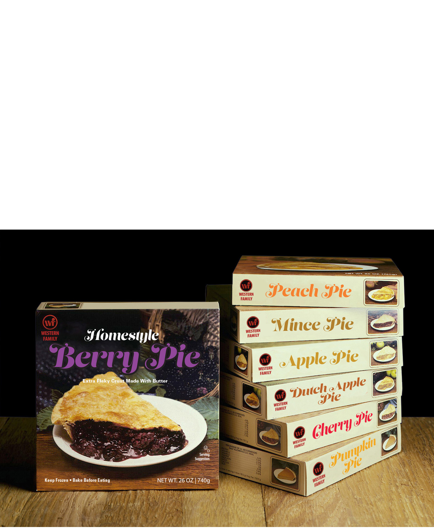
Company: Western Family
Art direction | Food styling | Design
The first book, is based on my love of the tomato and the nostalgia and imagery associated it — lovepuritypowermemory (tomato as metaphor). It deconstructs emotional and factual qualities of America's second most popular vegetable — the tomato. It lyrically explores in it's representation of text and visuals themes such as purity in food processing, genetic engineering, the memory of eating a grandmother's salsa, dinner with a loved one, canned label art from the 1920s, the etymology of tomato…and more.
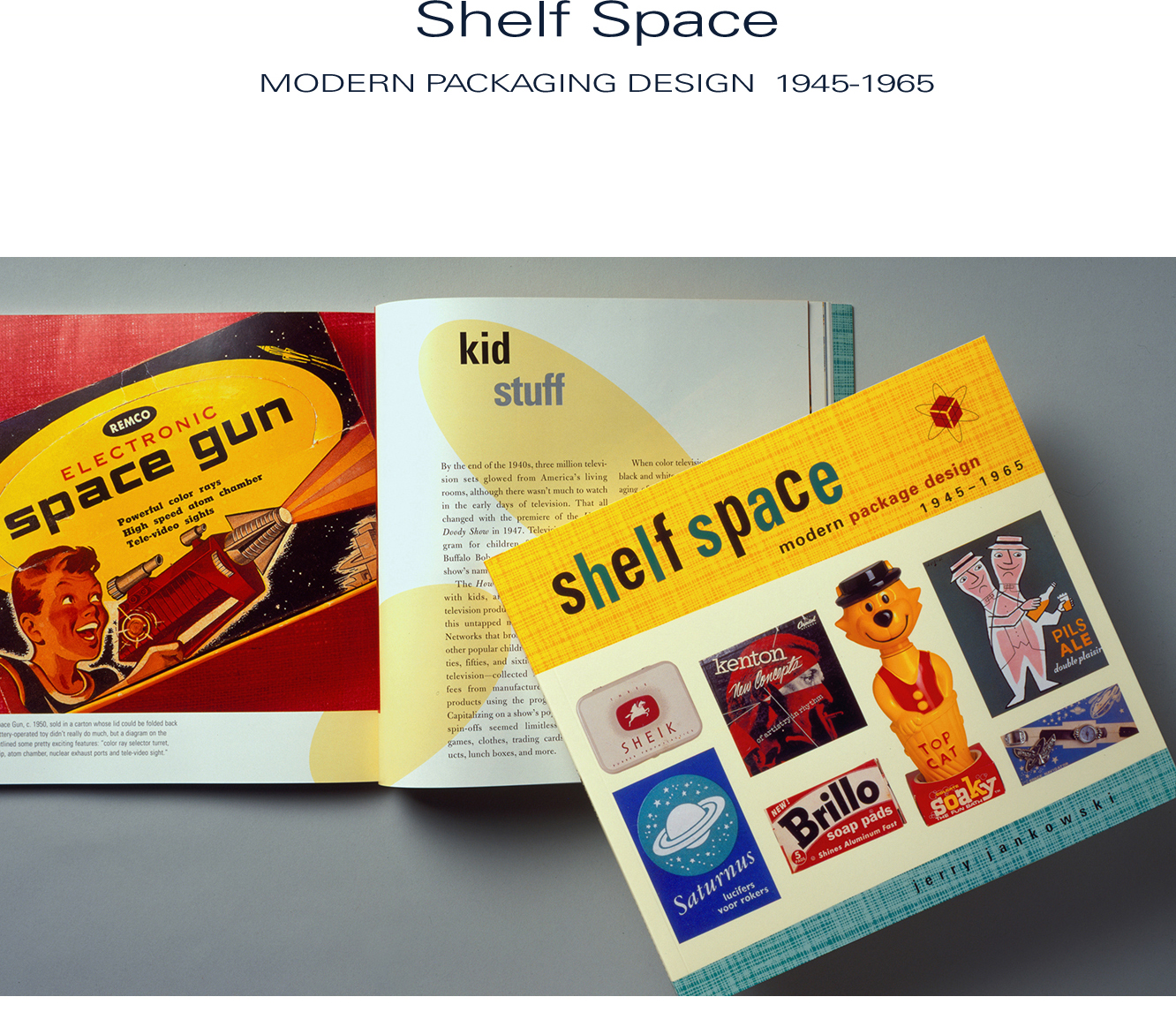
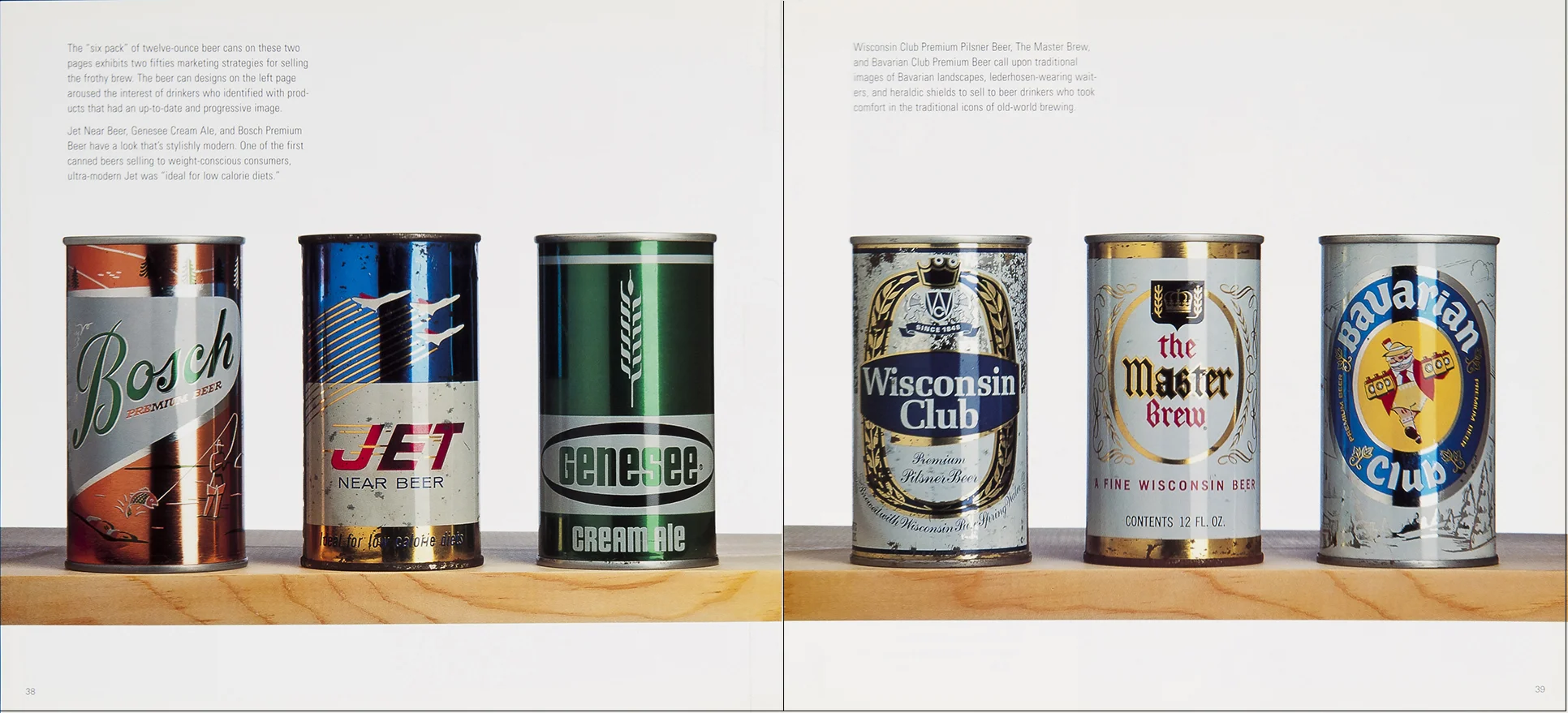
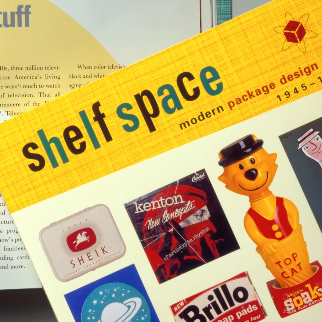
I authored Shelf Life—Modern Package Design 1920-1945 as the first of a two-volume set that was published by Chronicle Books. I researched and wrote the content, designed the layout and art directed the photography. Most of the tins, labels and boxes were from 20+ years collecting vintage packaging from such renowned flea markets as the Rose Bowl in Pasadena and the Porta Portese in Rome. The last book in this section is Shelf Space—Modern Package Design 1945-1965.
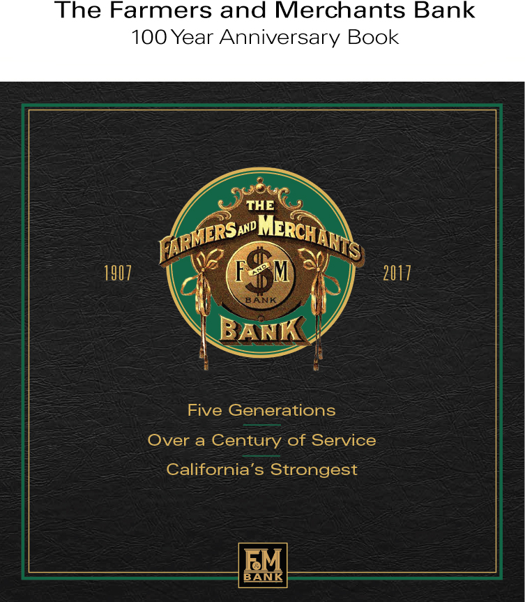
Farmers and Merchants Bank has been a solid and reliable institution in Long Beach for 100 years. This anniversary book celebrates that fact and details aspects of the bank that many of its clients are unaware of.
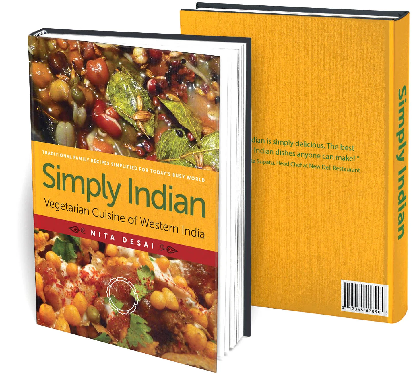
Simply Indian was a cookbook I worked on for almost a year with a well-known chef from the western region of India. I helped her plot out the flow of the recipes and worked with her on the photography and food styling.
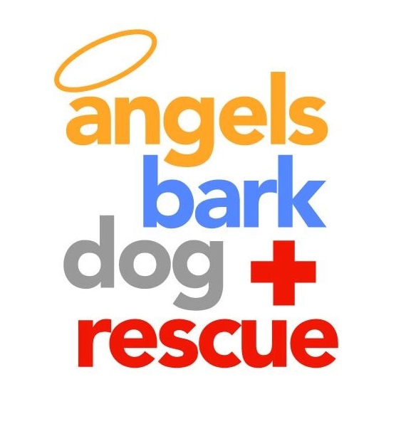
The logos shown in this gallery range from a dog rescue center in Hollywood, Golden West College’s 50th anniversary, a welders’ cooperative and a Long Beach restaurant.
Company: Angels Bark Dog & Rescue
Logo creation | Branding
Fifty year anniversary
Institution: Golden West College
Fifty year anniversary logo
Company: Hawei Ltd.
Logo creation | Branding | Packaging
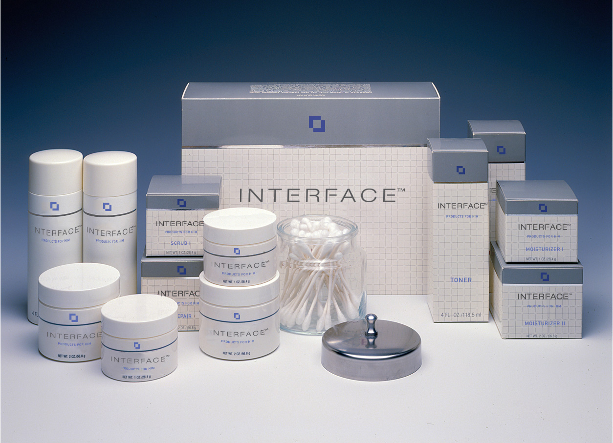
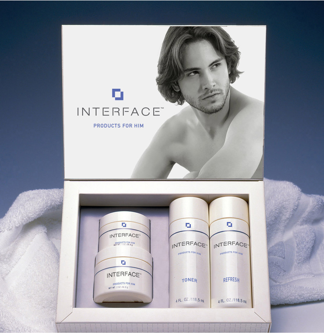
Business: INTERFACE, LTD.
Branding | Logo creation | Packaging Design
Company: Skeleton Crew Welding
Logo creation for quality independent welding company
Business: Eldorado Restaurant
Logo creation | Branding
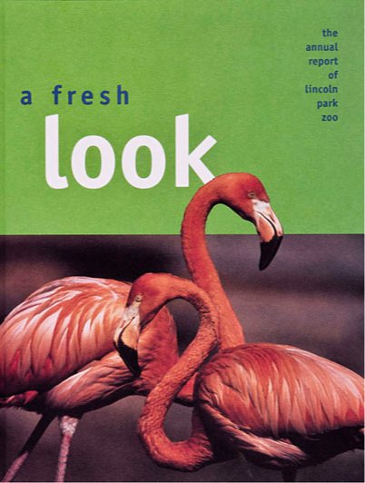
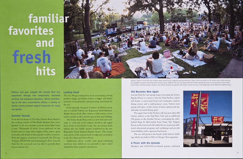
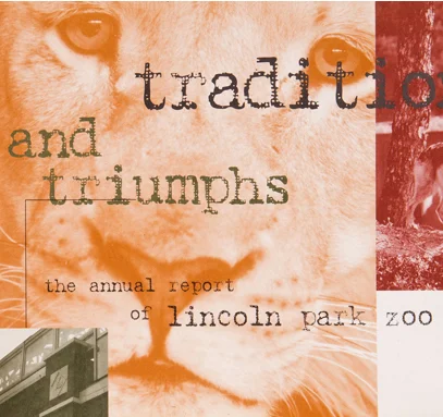
Although once exclusively printed, the traditional annual report is probably found more often today on companies' websites. Whether printed or digital, the annual report not only enlightens stock holders as to the value and direction of their holdings, it also can be used as an effective sales tool. This is especially true for a nonprofit like the Lincoln Park Zoo in Chicago. As Design Director, I art directed four of their annual reports. These reports highlighted the fun and cuddly, like newborns, and serious fund-raising capital campaigns.
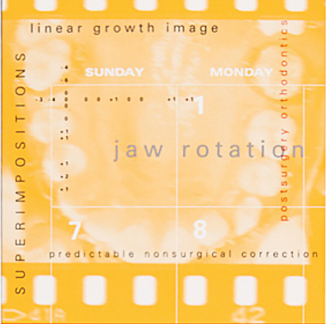
Ormco, a orthodontic company, relates it's charitable contributions in its annual report. This is the last annual report in this gallery.
Concept | Layout design | Photo art direction
Included in this gallery are posters designed for the theater and art gallery at Golden West College. The last two posters were designed for the city of Long Beach to promote tourism on their highly eclectic 4th Avenue. Illustrations were done by me.
Corporate Booklets featured in this gallery include one for a California company that gathers statistics for local, available employment and the courses taught in community colleges of that region. Stylistically, the brochures use strong color and photography to relieve the otherwise not-so-exciting charts.
This is portfolio shows examples of two corporate branding projects, one for Kerr TotalCare and the other for Axis|SybronEndo. Both companies offer high tech dental and surgical products.
Kerr TotalCare sells infection protection products to customers at dental offices, 95% of whom are women. The rebranding focused on retaining the company's signature blue and green colors, with some updating. The brand was kept "feminine" by using soft hues and curved lines, but avoided the use of pink as too stereotypical.
The managers at Axis|SybronEndo directed me to create a branded look that emphasized the high-tech, precision of their dental and medical instruments and equipment.
Brand development | Logo creation
Business cards with branded colors. Logotype underwent further modifications from initial launch.
The original logotype (left) with the redesigned logo/icon and logotype.
Six pages from the 24-page branding guide.
Original ad (left) with redesigned version.
The merger of Axis and SybronEndo companies necessitated the creation of a new logotype.
Business cards and branded colors.
Six pages from the 22-page branding guide.
Packaging design with the new branding.
Trade show graphics implementing the new branding.